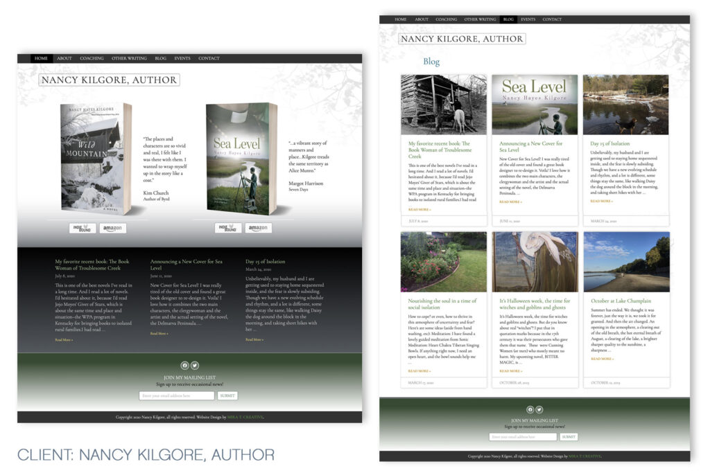
Two book author sites can be tricky to design – focus on the latest book, or both books? And how to make the design harmonize with both covers, without feeling generic? Nancy Kilgore already had a Blog-style website, but wanted a new site that was cleaner and clearer to navigate. I kept the background quiet but added just a little bit of texture so the site wouldn’t feel generic, but the covers would still pop. I went with greens and grays that complemented both books, and I chose a delicate serif font, that gives the site a sense of elegance and calm. View site.

