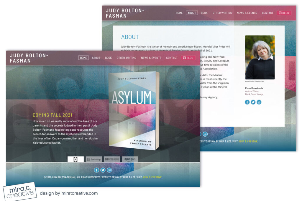
I knew Judy’s cover for Asylum would make a great background for her web site, because the colors, shapes, and textures are so evocative. But when I first tried it, the Home page actually felt a bit plain. Judy already had a site where she’d posted lots of family photos. Since her book is a memoir, I thought to overlay one of the family images on top of the cover background. The result was much richer, layered, and a little bit haunting — I loved it immediately, and was glad she did too! Visit: judyboltonfasman.com

