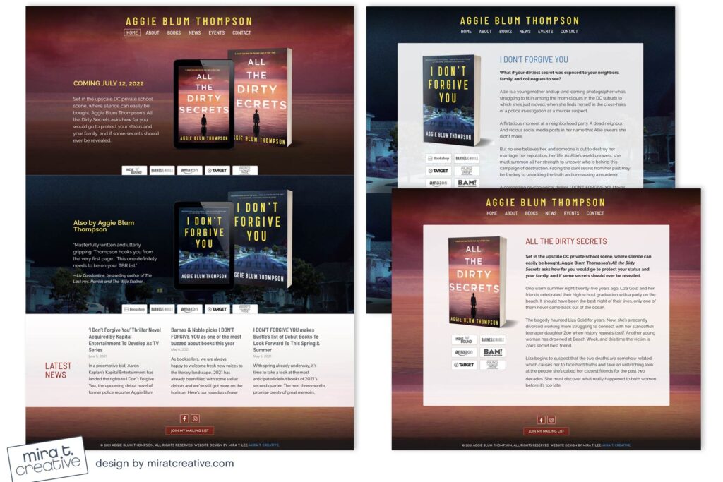
I’ve designed many sites for debut authors, and it always makes me happy when they come back to add book #2! (and #3!) Aggie wanted to feature her new book on the top panel, so I designed a new graphic and adjusted the colors. Even though the covers are pretty different, the yellow ties them together, and they do have a similar vibe. We decided to keep a wide panel for book #1 on the Home page, and to add Latest News posts as well.
Visit Aggie’s site.

