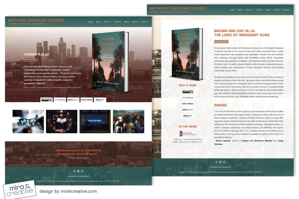
Anthony’s original website wasn’t in bad shape, relatively clean and organized, but he didn’t feel like it represented him. He wanted something with an urban, retro, 80’s LA vibe, that would match his new book cover, Brown and Gay in LA. The new site uses a distinct color palette: aqua, rose and orange, as well as a retro titling font named Righteous. I love the uniqueness of this site, with its combination of curves and straight edges. It took awhile to complete, but the final product was exactly what my client wanted!
Visit: anthonyocampo.com.

