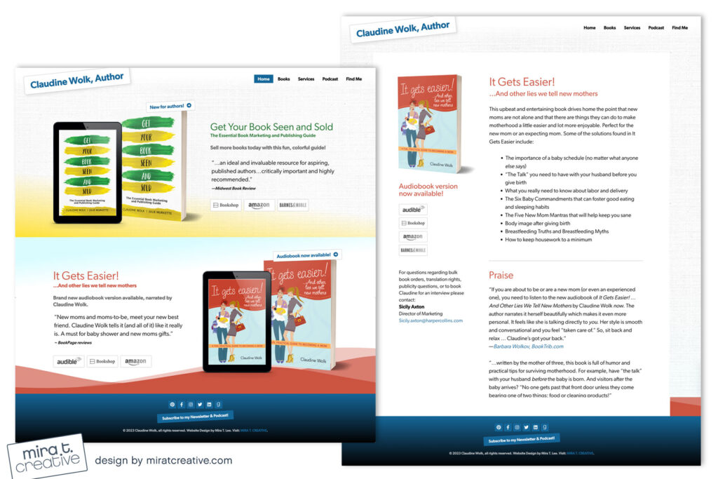
Claudine wanted to feature two books on her Home page, so we went with a stacked “one-page” layout and included her bio/contact info. One of my biggest beefs with pre-fab templates is how they use unnecessarily tall sections that scroll on forever, so I was especially happy with the compactness of Claudine’s site. I also love that it’s the right mix of professional, friendly, and commercial – just the right tone for her books!
Visit Claudine Wolk’s site.

