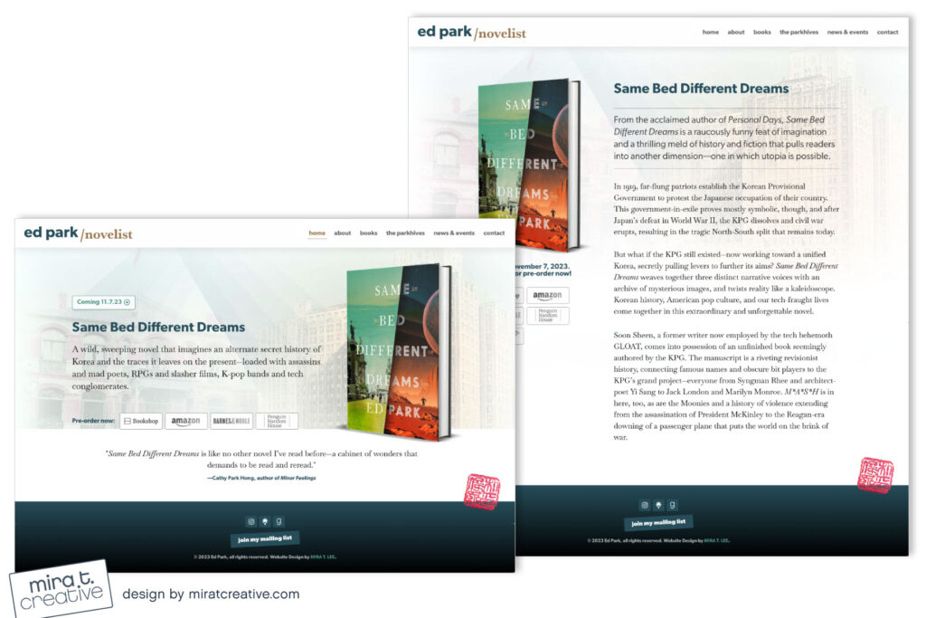
Ed Park’s website redesign was an interesting challenge. His first novel, Personal Days, is a satirical office drama with lots of humor, while his new book, Same Bed Different Dreams, is quite different – a genre-bending historical novel set in Korea, with touches of sci-fi. Ed is also an accomplished journalist. I wanted his site to feel contemporary, while working in a hint of the historical. I ended up choosing a strong sans-serif font for titling, which I paired with Baskerville, a serif font Ed liked. I also kept the site lite and went with lower-case on the header for a modern feel. I was able to use two images from the new book to create a subtle “historical” background, and for non-Same Bed pages, I used a crumpled paper background for a bit of texture. Overall, I think the site feels well balanced, and very much like Ed — who I actually happen to know from childhood, as we played piano duets together at the age of six!
Visit: https://ed-park.com/

