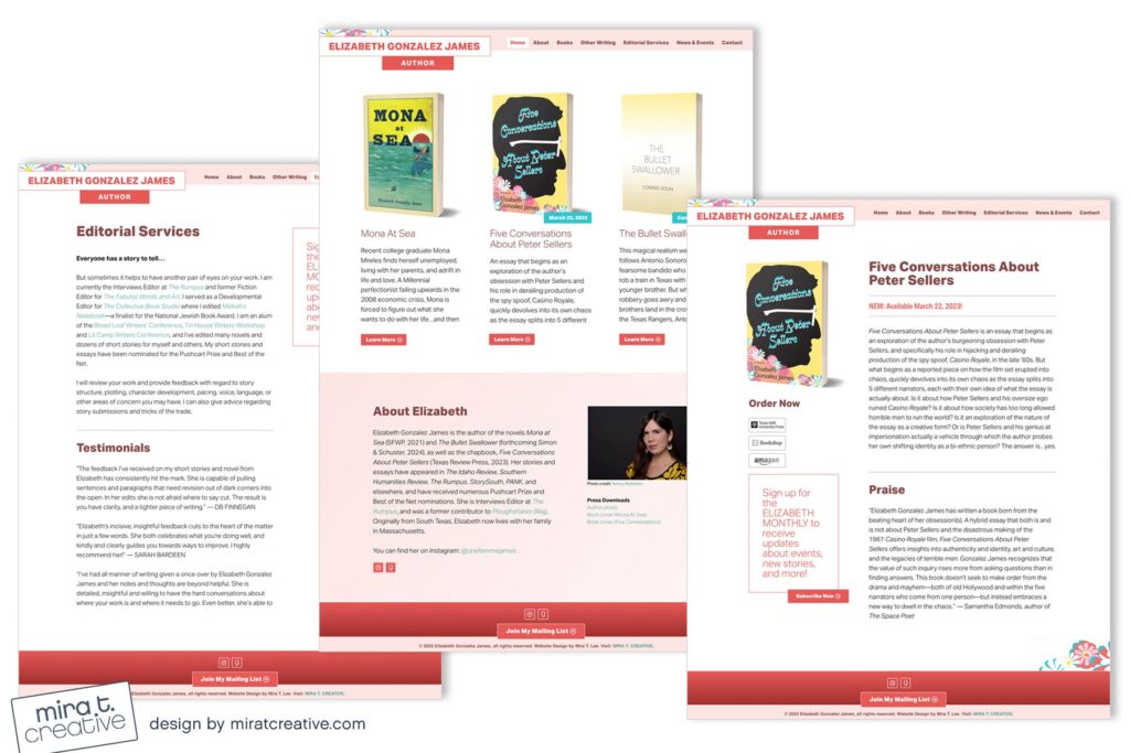
Elizabeth had two new books forthcoming, so she wanted to transform her basic debut site into one that felt fuller and more vibrant. We decided to feature all three of her books on her Home page and go with a “one-page” format to include her bio and contact info. I love the rose/pink color palette, and the header, which gives the site just a touch of whimsy. I’m also a big fan of the font we used, which is contemporary but has a nice heavy extra-bold weight.
View Elizabeth’s site.

