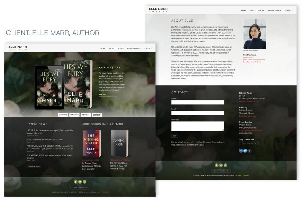
When Elle Marr contacted me about redesigning her website, she had a very specific idea of what she wanted: a clean, “one-page” site. Elle had already published her first novel and was preparing to publish her second, so we decided to devote the top panel of her Home page to showcasing her second novel, Lies We Bury, but still include her first, The Missing Sister, on a tier below. We also decided that each book needed its own page to hold all the important content: synopsis, blurbs, reader questions, and more. So it’s sort of a hybrid site – Home, Books, Latest News, About and Contact sit on the Home page, but it’s got a few branches too. I actually LOVE the way Elle’s Home page turned out, with the About and Contact sections accessible using page anchors, and the alternating light and dark panels. It’s compact, elegant, and user-friendly. I think I might even recommend this format to other authors in the future! Elle was also super organized and easy to work with, so this project was just a joy!
Visit: ellemarr.com.

