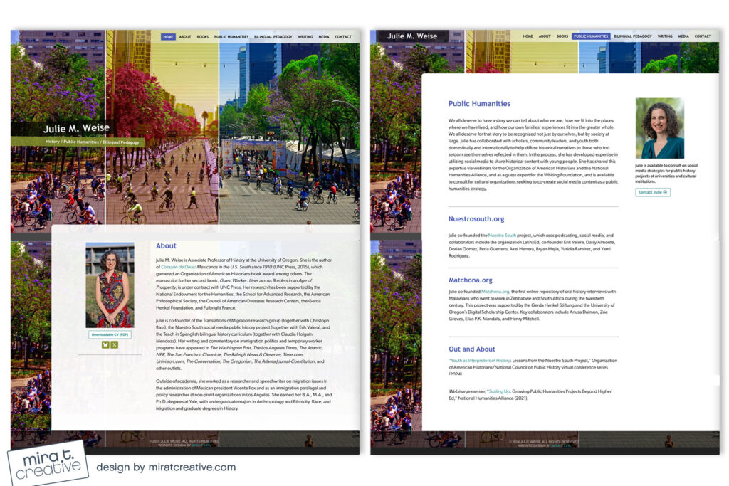
Julie wanted a site that conveyed vibrancy and color. She selected this image of a busy street in Mexico City, but instead of just plopping it on the page, I decided to play around with it, creating three interconnecting panels each with a different color treatment. I love how it feels unique and full of Julie’s personality. Definitely not just another stodgy academic site.
Visit Julie Weise’s site.

