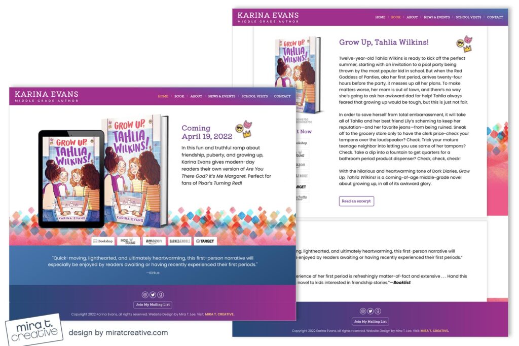
I absolutely loved working on Karina’s middle-grade debut site, because when else do you get to go all out with bright purples, oranges, pinks and blues? For the site background I created a colorful graphic that complemented the cover without taking from it too literally, and even though the site is bright and youthful, it’s still super clean and professional, since her target audience is mainly parents, teachers, and librarians.
Visit Karina’s site.

