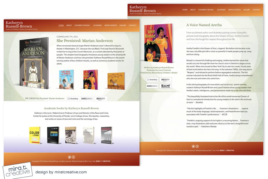
Katheryn is one of my many multi-talented clients, both a children’s book author as well as a scholar and writer of academic texts. She wanted her website to be warm and friendly, appealing to parents, teachers and young readers, but still professional enough for a serious academic. We decided to showcase her children’s books on the Home page, but included a carousel with her academic books in a secondary panel. The sage green and warm orange/browns work for both audiences, and we added a “bounce” to the Home graphic, just for fun!
Visit Katheryn’s site.

