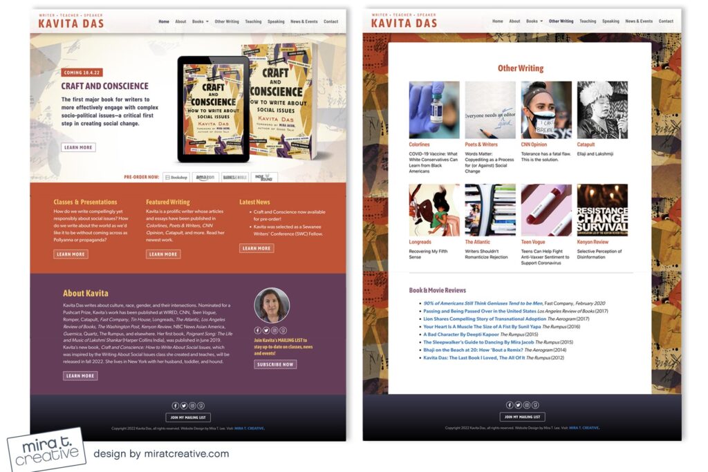
Kavita wanted a bold site to showcase her new book, Craft and Conscience, as well as the classes and presentations that accompany it. We used secondary panels on her Home page for announcements, and for site background I drew from the rectangular shapes and colors of her cover. I love the oranges and purples, and the hint of commercial feel.
Visit Kavita’s site.

