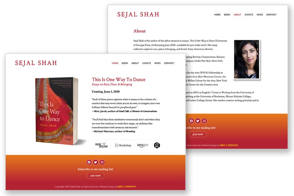
Sejal Shah had a website, but her new book of essays, This Is One Way To Dance, required a new website that would match its energy. The challenge was, Sejal also wanted a very spare site, with lots of white space and easy to read text. I used orange and reds to brand the site and was meticulous with typography. The book cover itself carries the bulk of the color, along with the wide footer — who knew a footer could help so much? But when a site is spare, every bit of color pops. It’s elegant, but vibrant. I love the way it turned out. Visit: sejal-shah.com.

