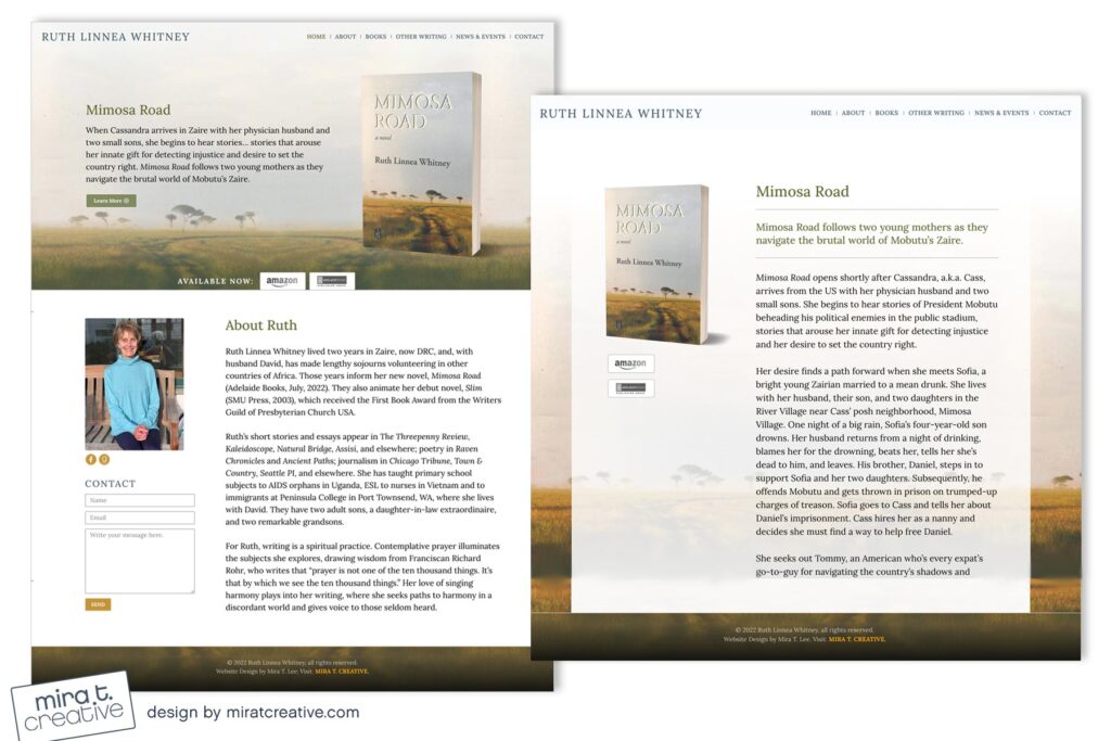
Ruth’s site features her second novel, Mimosa Road. Because the cover art feels so expansive, I decided to go with a full image background (no separate header bar). I love the gentle color palette, which I continued across the site (with the exception of the page for her first book, Slim, which has a bold, matching background). As Ruth said, “it feels just right.” That’s what I aim for in all my projects. 🙂
Visit Ruth’s site.

