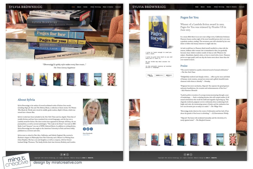
Sylvia is a prolific author who needed a website redesign. She didn’t have a new book to promote, so for the Home page we decided to use a photo of her books stacked on her coffee table. It’s a simple image, but I love how it feels so warm and personal. Whenever possible I advise authors to use their own images – it’s generally more inviting than stock photography, though stock photos can be great as background textures. Sylvia also wanted a quote on each Book page, so I picked a typewriter font to set that apart from the rest of the information. I like how these details make the site more intimate, while still feeling completely professional.
Visit Sylvia’s site.

